Case studyBrand site
Clasico.io
A boldly animated brand experience.
A landing page with immersive motion for a culture-first learning platform.
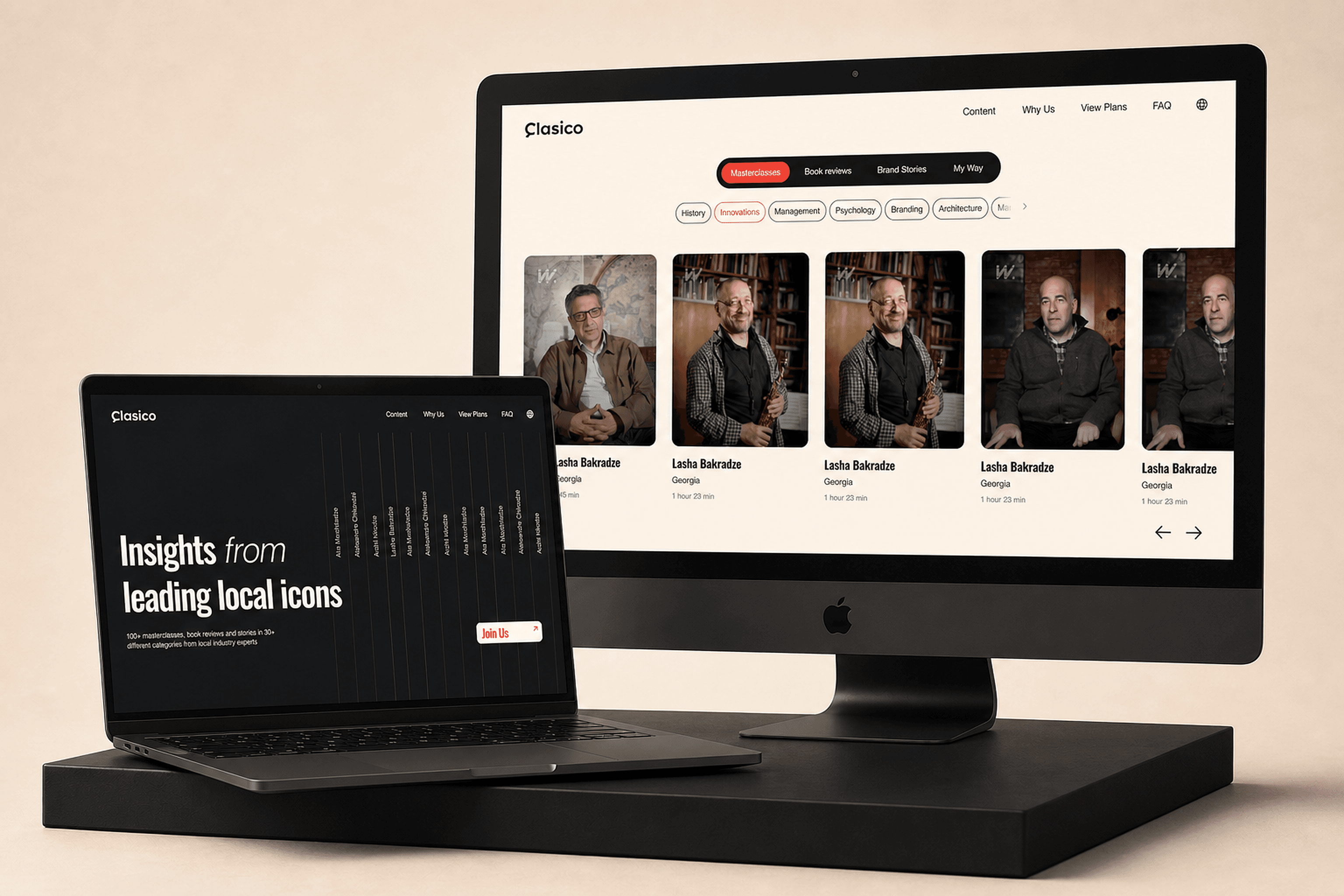
The work, the thinking and the value behind it.
Clasico helps culturally specific content travel across languages without losing what made it relevant in the first place. Its website needed to express that fluidity and ambition before a visitor reached the product detail.
We translated the proposition into an interaction-led brand experience, using motion, pacing and responsive composition as part of the message rather than as decoration around it.
Creators and organisations producing multilingual learning content
Brand site
- Digital art direction
- Interaction design
- Motion system
- Front-end engineering
The proposition
Clasico creates high-quality content in native languages, then uses AI to translate it for global reach — messages that resonate locally but scale globally. Their belief is that content should never be generic, but crafted with culture, language and authenticity built in.
That creates a difficult communication task for a landing page: it has to feel global without becoming anonymous, and technically advanced without falling back on familiar AI-product clichés.
The experience direction
To bring that philosophy online we built a site that carries it through motion: an animation-heavy experience where every scroll, transition and interaction reinforces the sense of fluid global storytelling and local relevance.
The result is a brand presence that does not simply state “we translate and scale content” — it shows it, through rich animation, smooth flows, and visual energy that mirrors the product idea.
Large visual moments establish the brand quickly, while smaller transitions connect sections so the page reads as one continuous narrative rather than a stack of independent marketing blocks.
Built for movement
GSAP drives the choreography, but the implementation is organised around the content hierarchy first. Motion gives emphasis, reveals relationships and guides attention without obscuring the page's core message.
Responsive behaviour and performance were treated as part of the motion design so the experience could keep its energy across devices without asking every screen to behave identically.

What the work puts in place.
What changed
- A site that demonstrates the product idea rather than describing it
- Motion carried through every scroll and transition
- Performance held steady under an animation-heavy build
Project surface
- Digital art direction
- Interaction design
- Motion system
- Front-end engineering
Built with
- Next.js
- GSAP
Something here look like the problem you have?
Start a project